Fully Responsive Design: A Website That Looks Perfect Everywhere

/ Home Business Website Fully Responsive Design: A Website That Looks Perfect Everywhere

Overview

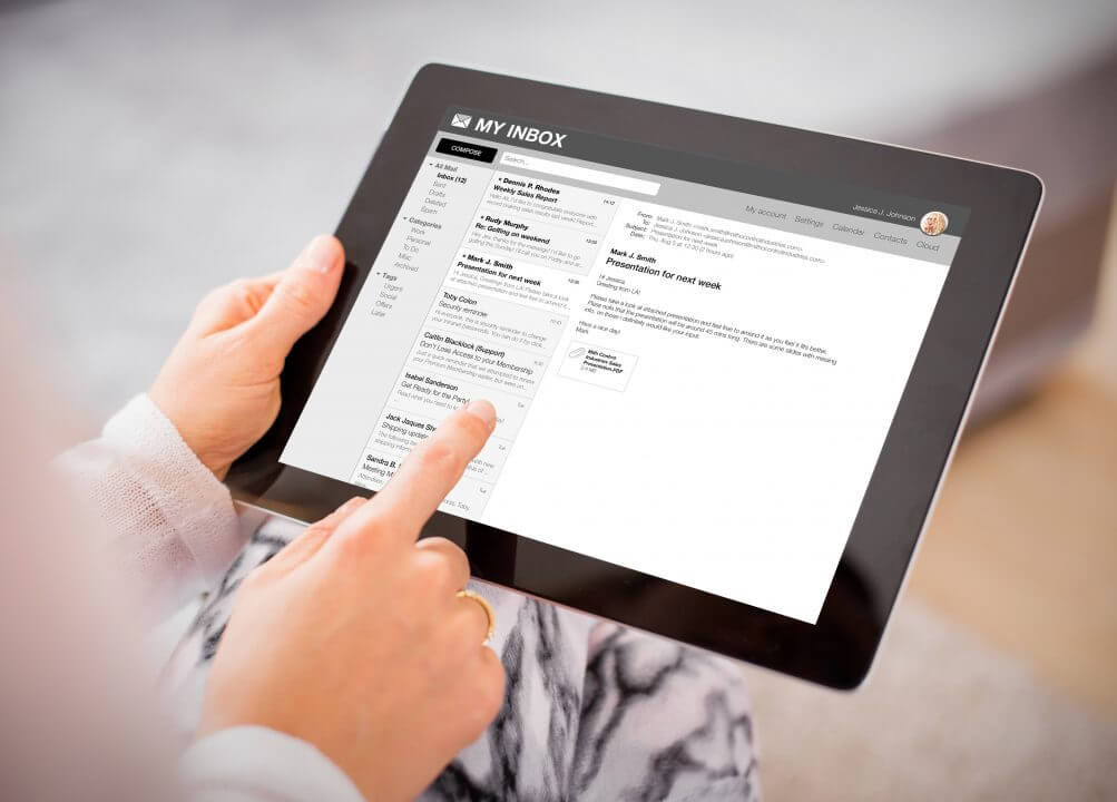
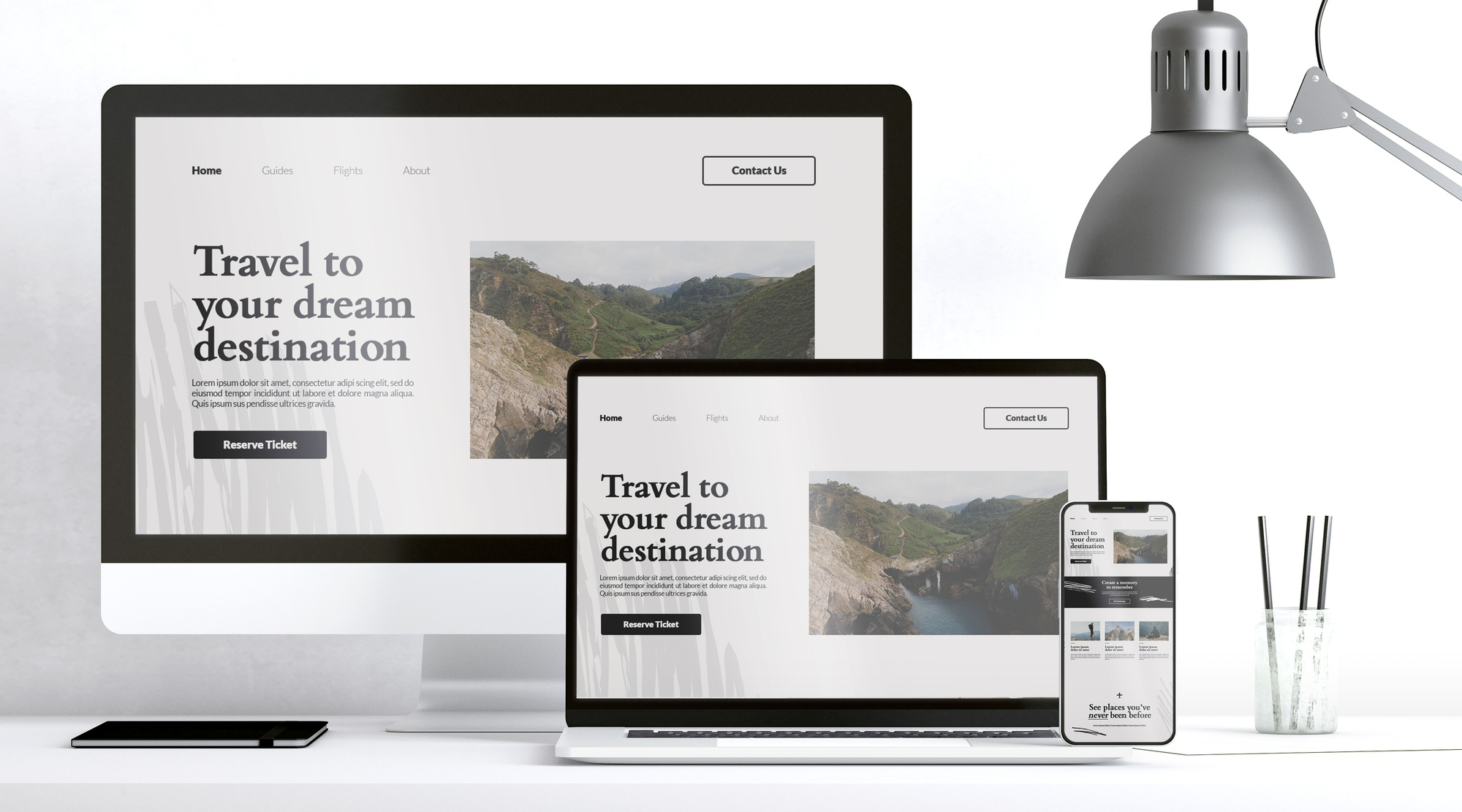
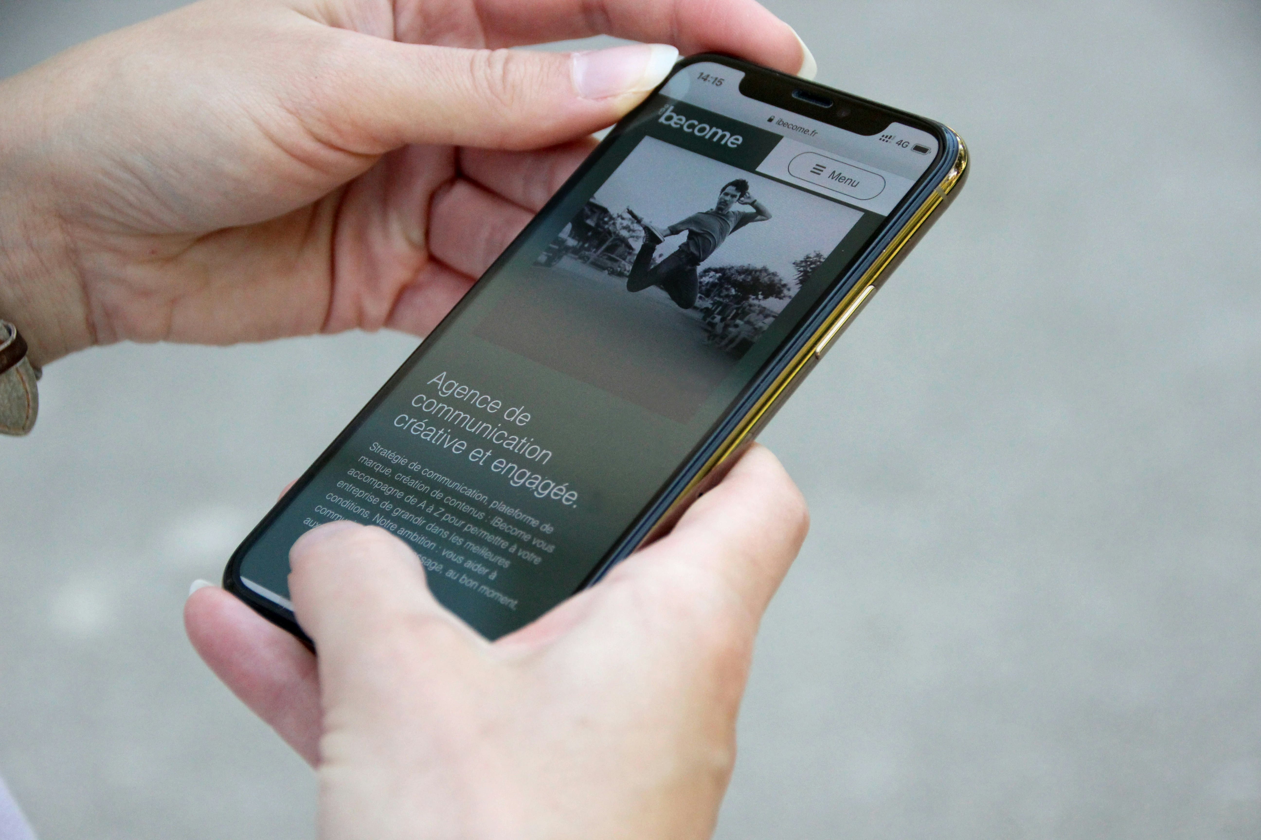
Today, your customers aren’t just browsing from desktop computers. They’re on smartphones, tablets, laptops, and even large screens. That’s why your business website needs a Fully Responsive Design.

A fully responsive website automatically adapts its layout, text, and images to any screen size. Whether someone views your site on a 6-inch phone or a 27-inch monitor, it stays clear, professional, and easy to use.

It’s like having a digital outfit tailored to fit any body shape — always sharp, always professional, no matter where it’s seen.

Features (What It Is)

  • Adaptive layouts that scale to different screen sizes.
  • Flexible images and text that resize without breaking.
  • Mobile-first design to prioritize smartphone users.
  • Cross-device compatibility — desktops, tablets, and mobiles.

Advantages (Why It Matters)

  • Universal access: Every customer sees your website at its best.
  • Professional impression: A consistent look builds credibility.
  • Search engine friendly: Google ranks responsive websites higher.
  • Future-proof: Adapts to new devices as they emerge.

Benefits (For You)

  • Customer trust: Visitors take your business seriously when your site looks polished everywhere.
  • More sales & leads: Smooth mobile experiences boost conversions.
  • Peace of mind: No need for separate “mobile” websites.
  • Cost-effective: One design works for all devices.

Results That Matter

  • Real-world example: A local SME upgraded to a fully responsive design. Mobile visitors stayed 2x longer and inquiries increased by 30%.
  • Industry fact: Over 60% of web traffic comes from mobile devices — responsiveness isn’t optional anymore.
  • Customer psychology: A broken or hard-to-use mobile site makes customers leave immediately.

How Web Temple Gives You an Edge

Some providers still deliver outdated, non-responsive designs. At Web Temple, Fully Responsive Design is our standard:

  • Mobile-first approach → Optimized for the majority of visitors.
  • Consistent branding → Your site looks polished everywhere.
  • SEO advantage → Better rankings thanks to mobile-friendly compliance.
  • Business-first clarity → We explain it as “one website that fits all screens,” not jargon.

Share On:

Related Posts