Overview
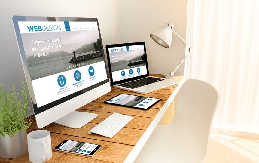
This is how a responsive website looks like. It adapts to different browser sizes as if it adapts to different screens on different devices.
Dec 27, 2014
1 min read

This is how a responsive website looks like. It adapts to different browser sizes as if it adapts to different screens on different devices.
A responsive website is a website that automatically adjusts its layout and content to fit different screen sizes and devices — such as desktops, laptops, tablets, and smartphones.
Share On:
1. Click and run Outlook 2007. 2. On top of Outlook 2007 main window, click Tools menu, then Account Settings.
11 September 2012
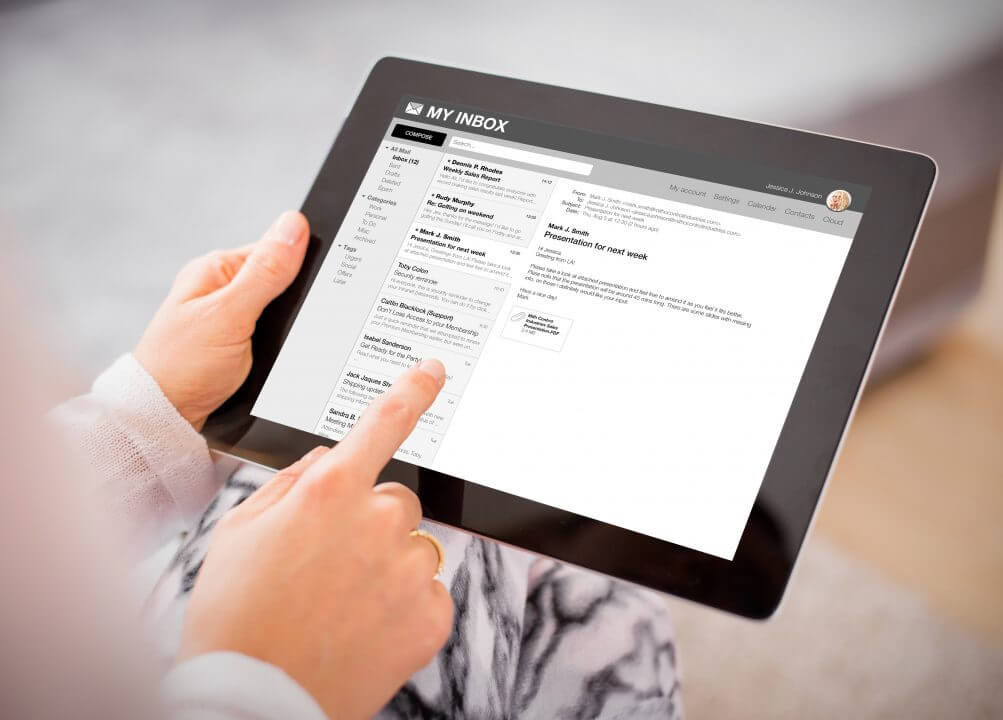
To configure your email account on the iPad, please kindly follow the guide
26 January 2013
To configure your email account on the iPhone, please kindly follow the guide.
26 January 2013